
LOADING
DESIGN &
STRATEGY

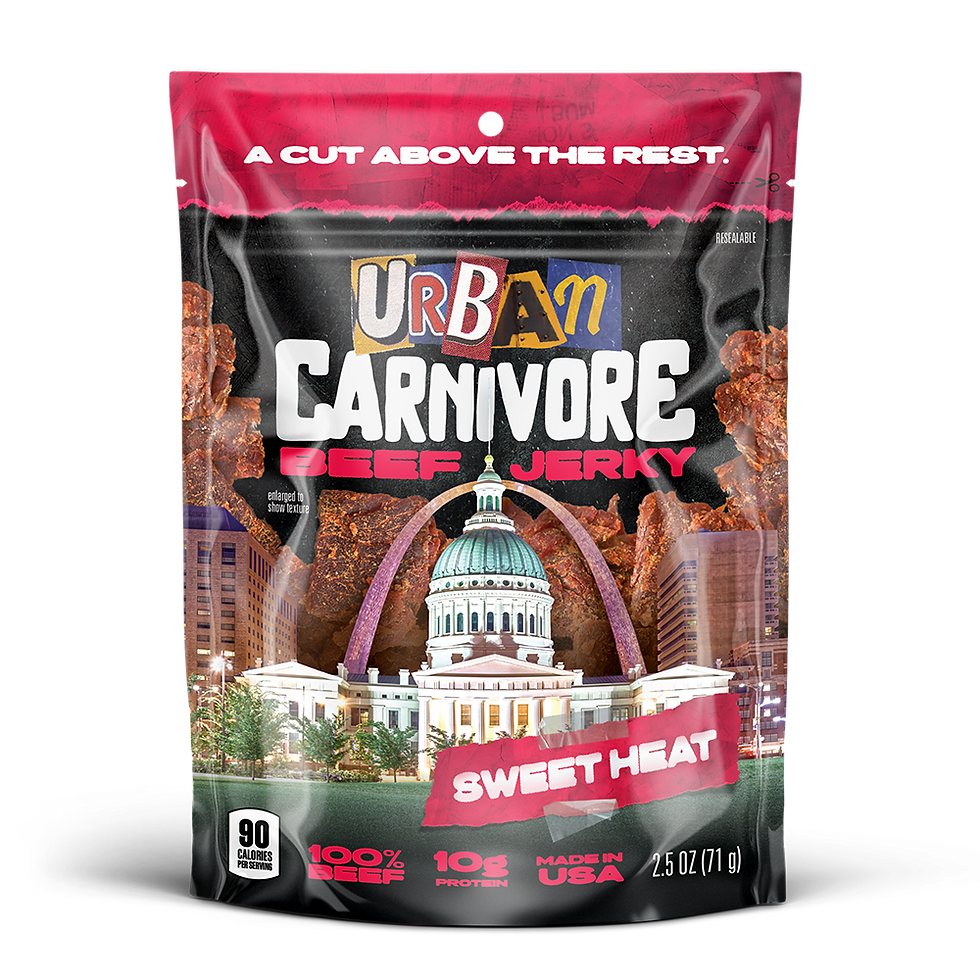
Urban Carnivore is an initial concept for a beef jerky product aimed at the inner city market, as opposed to the outdoorsy focus that most emergent jerky products tend to adopt. Conceptualized by the CEOs of Sow Good, I was given the name 'Urban Carnivore' and asked to run with it, and provide a comprehensive brand identity & product strategy that aligns with the chosen name as well as the consumers we hope to reach. The initial product launch was set for the UAE/Arabic market, as American-made CPG products are considered a premium item in that region. This knowledge lends to the direction I decided to take in both the design and strategy showcased below.
Role: Art Director, Principal Designer
Team: Brand Identity, Strategy, Product Design

BRAND
IDENTITY
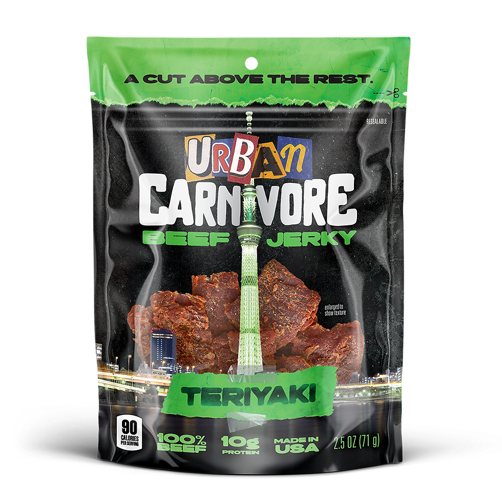
The marriage of "Urban" & "Carnivore" in logo form accentuates (with little subtlety) who we intend to cater to. The concept of ransom letter is not uniquely 'urban', but it's physical presence & textured, disjointed form directly parallels with the gritty, inclusive and diverse energy of urban life and it's rebellious undertones.
The typography of "Carnivore" represents what exists inside of every meat-eater. Just because we're city-slickers instead of country bumpkins doesn't mean we don't have that same animalistic urge to bite into tender, flavorful, naturally-occurring protein. In this logo, it evokes a primitive shakiness and aggressive disposition indicative of what it means to be a carnivore.
This logo, for the most part, can seem 'all-over-the-place', and that's not on accident. But there's a difference between out of control and uncontrolled - the type here harkens to the latter.


STRATEGY
Campaign

Piggybacking off the brand voice, the main idea of Urban Carnivore's consumer-facing strategy is that no matter where you're from - the city, the suburbs, or the country - you deserve amazing jerky. We facilitate a passionate conflict between these jerky-loving communities.


PRODUCT
DESIGN

THE STATUE OF LIBERTY
NEW YORK CITY
ORIGINAL
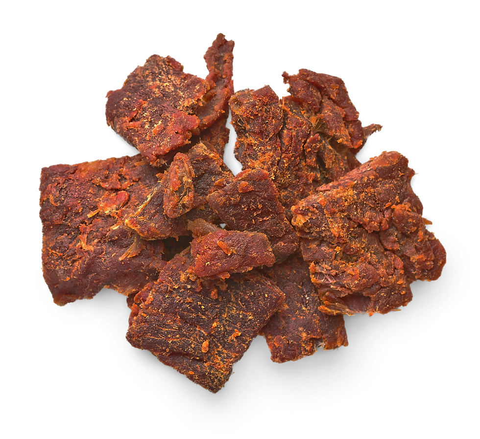
The art direction of the packaging mirrors not only the humble* beginnings of it's founders, but the spirit of what it means for something to be 'urban'. For our original flavor, we went back to our origins as New York City entrepreneurs. And what better representation of NYC - or of an American made product in general - than the Statue of Liberty herself?
NEXT PROJECT

