// LOGO
SEC. 01 OF 05
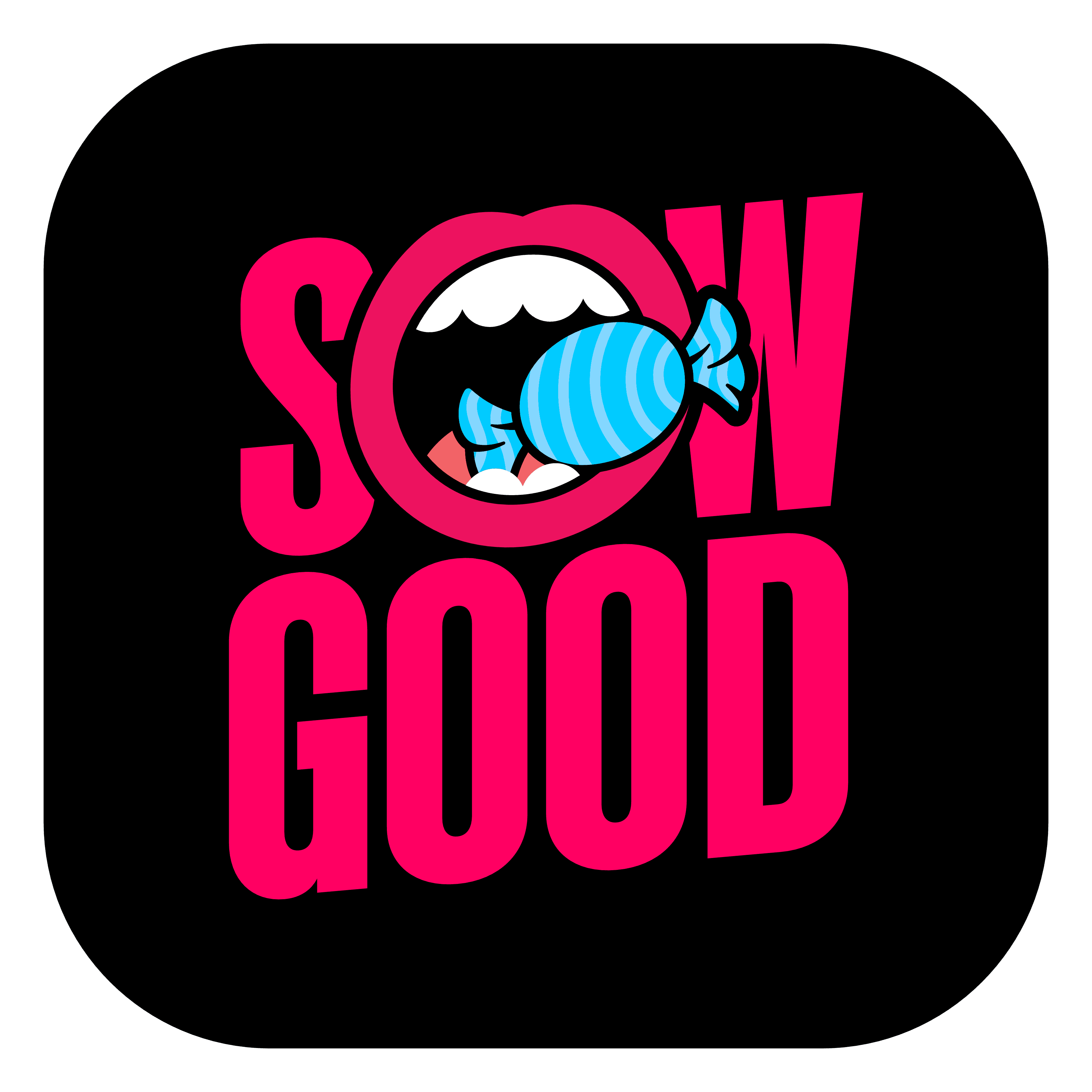
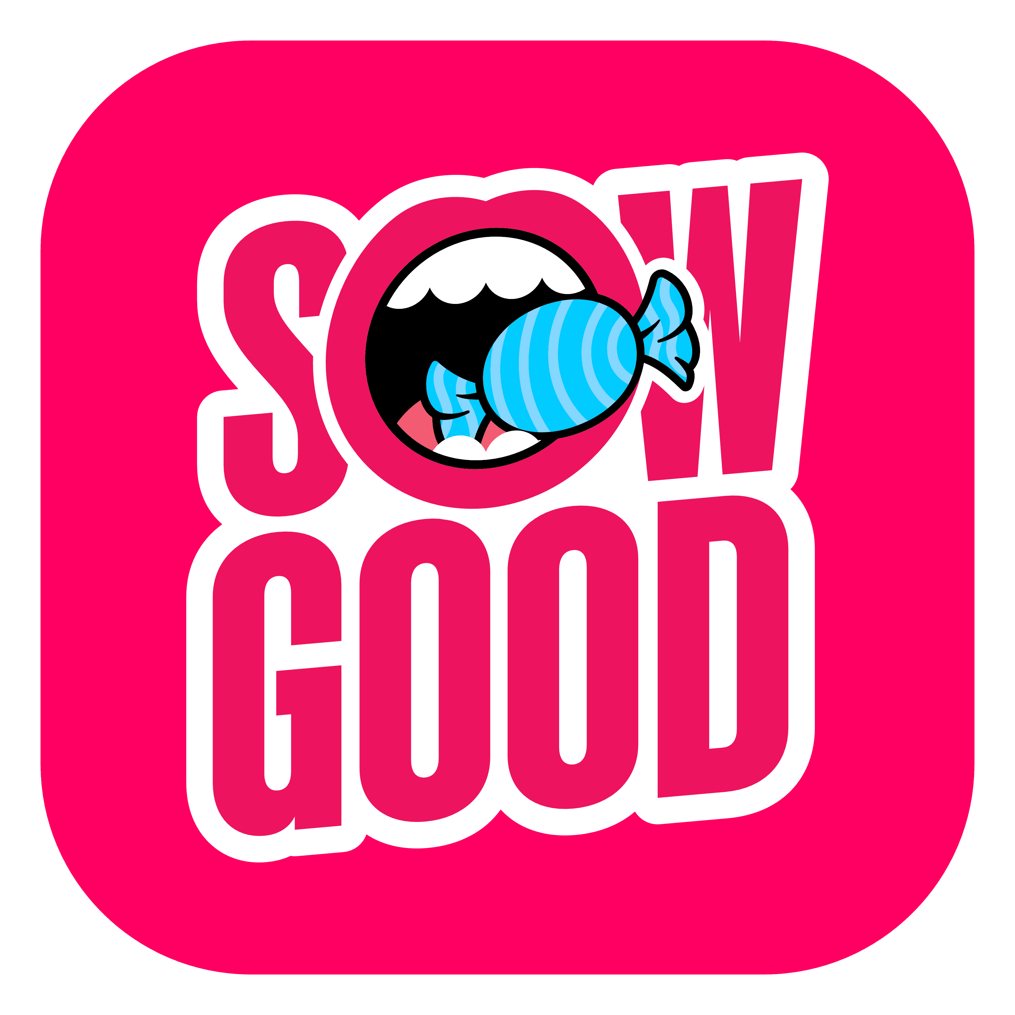
Sow Good's first logo had a problem - the manner in which it was constructed lacked versatility. The lack of a border/stroke around the text made it hard to implement on certain backgrounds without a drop shadow, which has the potential to look haphazardly thrown together. There were two color configurations for the wordmark - white & black. It only incorporated one of the brand's colors.
Trademark considerations prevented me from making extensive changes, but the changes that I was able to implement are subtle, yet effective as an attractive update. They include the addition of a thick stroke around the entire logo to assist with placement on backgrounds of all types. The stroke around the 'mouth' portion has also been increased to match the 'heft' of the text & the stroke.
The next change is to the colors - instead of the wordmark portion of the logo being restricted to black/white, It's now either white &/or borderless, or red, based on the context of it's placement. And finally, it was skewed five degrees to add dynamism & movement. These same changes were made to the horizontal orientation.


SEC. 02 OF 05
// ICONS
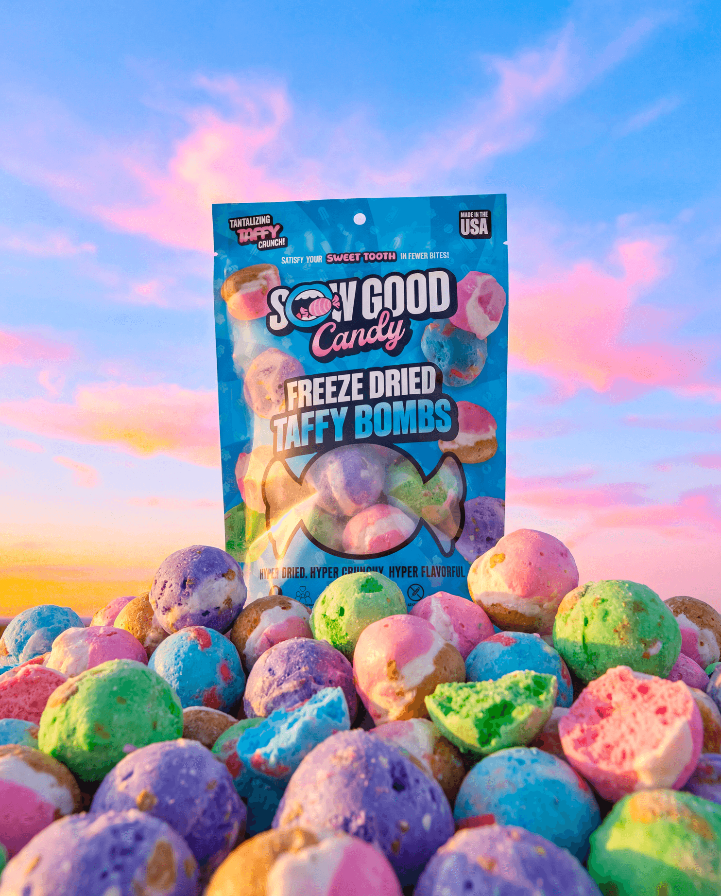
As a candy company with SKU's paving the way for a new confectionary category to compete with chocolates & gummies, specific callouts were created to pair with the presentation of our product. The very nature of freeze-dried candy is that it's light & airy, crunchy, and concentrated with flavor.
Other pairings include modifications to the logo to succinctly express the nature of our company - for instance, "Sow Good Freeze Dried Candy". Our slogan, "Sweeten the Revolution", marks the underside of every bag in every store.


//COLORS
SEC. 03 OF 05


SEC. 04 OF 05
//TYPE


//VOICE
SEC. 05 OF 05


// WEBSITE
SEC. 01 OF 05
Our website should fully embody our brand identity, as it’s often the first touchpoint for new consumers. People judge a brand’s legitimacy by its branding - Sow Good outperformed competitors by choosing refined, branded packaging over basic alternatives. I plan to extend this refinement to our website, positioning us as freeze-drying experts and establishing our legitimacy in this emerging category.


SEC. 02 OF 05


// Digital
SEC. 03 OF 05


SEC. 04 OF 05
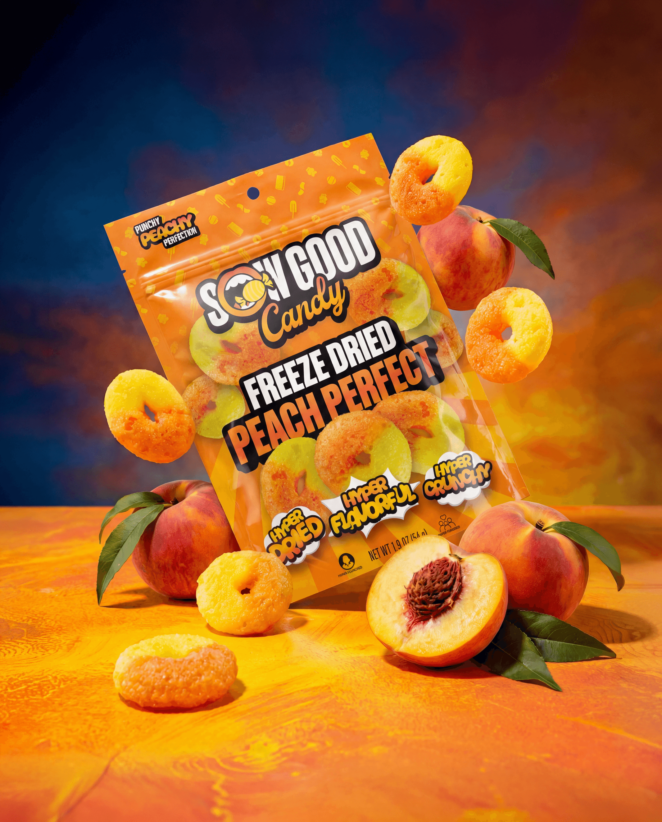
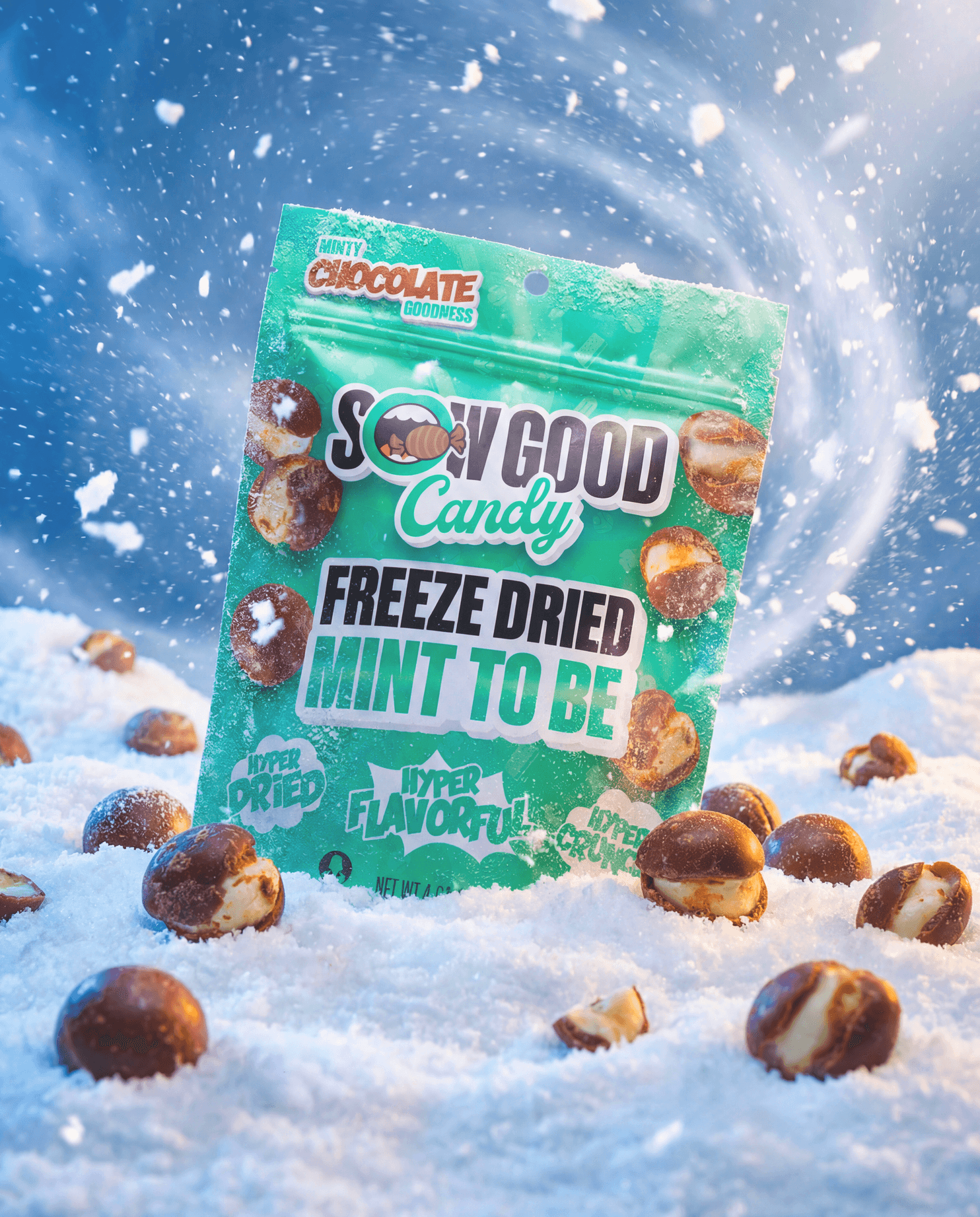
// PHOTO
Product photography is a cornerstone of modern product marketing, serving as the critical bridge between consumer perception and purchase decision in the candy/snack industry. Therefore, I make sure whenever, wherever consumers see our product, it is presented in the most vibrant, appetizing light possible, & as close a representation as possible to the real thing. This'll be on sell sheets, advertisements, and the packaging.
I handle every step of the process, from snapping the raw images with my company-provided Canon T7i (due for a major upgrade) to post-processing through Adobe Lightroom, then dropping it into Photoshop for background removal, pinpoint edits, color corrections, and more to make the image as high-quality as possible.


// RETAIL
SEC. 05 OF 05


// DESIGN
SEC. 01 OF 04
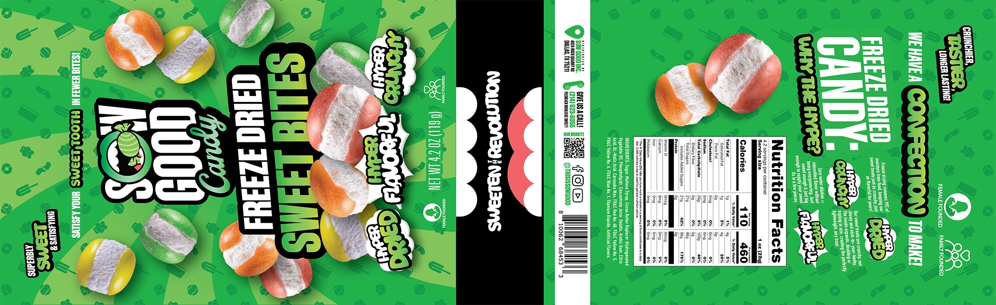
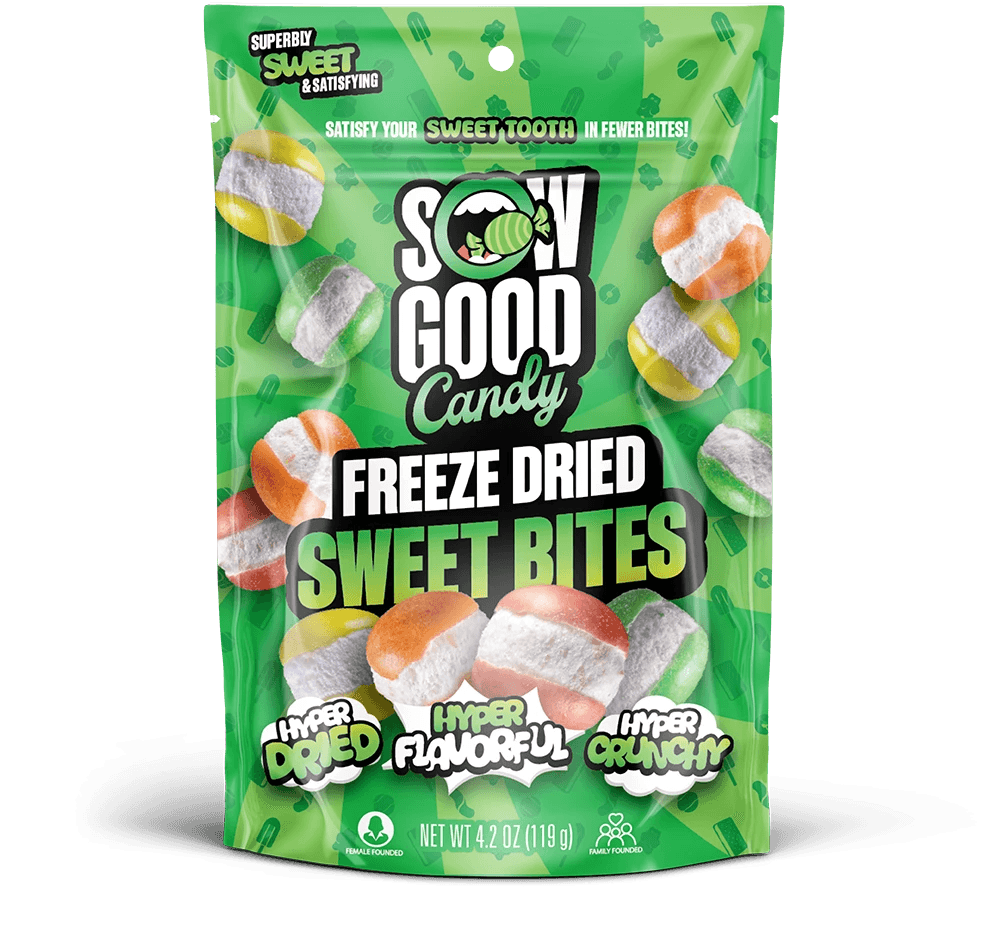
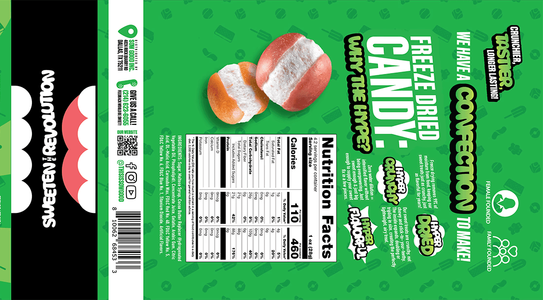
Sow Good wasn't always a pioneer in the confectionary category - their roots harken back to their namesake - to sow good throughout the world by creating healthy, sustainable and shelf-stable foods like granola, smoothes, and freeze dried fruits. During this period, their packaging, containing simple colors & noisy gradients against a stark white background, perfectly captured what a health-based food item should look like.
The problem is, we're in a different lane now: Candy, which is already defined by vibrant packaging, playful typography, and messaging presented so sweetly, you get a sugar rush just by reading it. This was the opposite of our candy packaging. And although it was low (read: not at all) on the priority list of management, one of the first major projects I initiated upon my arrival at Sow Good was a wide-scale redesign of our packaging. Below is an analysis of the state of packaging at Sow Good from 2023 to 2025, and the changes I managed to get approved.